(Nathan Greaves)
Collaborative by default, independent when needed.
© 2026
(01)
(UX/UI Moolo Personal Finance Assistant)
© 2026
Project overview
Role: Lead Product Designer — UX strategy, product framing, interaction design, research, prototyping. Brand Designer ( Logo + Illustrations)
Timeline: 4 weeks
Platform: Web and Mobile app
Tools: Figma, Lovable, Firefly (illustrations), Illustrator (Logo Creation)
Project type: Fintech personal finance tool
Background & brief
Moolo is a concept designed around a core insight:
People don’t avoid finance because they lack data —
they avoid it because they don’t understand the meaning of that data.
Most personal finance tools focus on reporting.
Moolo focuses on interpretation — answering:
“Am I okay?”
“What happens next?”
“What should I do?”
A benign dashboard does not solve financial anxiety.
A forecast-first guided experience does.
Problem
Problem
Traditional finance tools overwhelm users with:
dense charts
financial jargon
spreadsheets disguised as dashboards
These patterns make people feel:
unsure
confused
judged
intimidated
The core challenge became:
How do we design a product that explains the future,
not just what happened?

Dense dashboards prioritise data density over decision clarity.
Dense dashboards prioritise data density over decision clarity.
Research & Benchmarking
I evaluated how existing products handle financial explanations, focusing on:
Goals of benchmarking
How do products communicate financial health?
Where do users feel confident vs overwhelmed?
What interaction models support ongoing behaviour change?
Key competitor reference: Cleo
Cleo is currently the most comparable mainstream finance app:
AI assistant with conversational insights
Everyday language over financial jargon
Habit-building nudges
However, Cleo is chat-first:
Conversation is the destination.
Moolo’s divergence: Forecast is the destination.
Moolo positions AI as support for decision-making, not the core product itself.

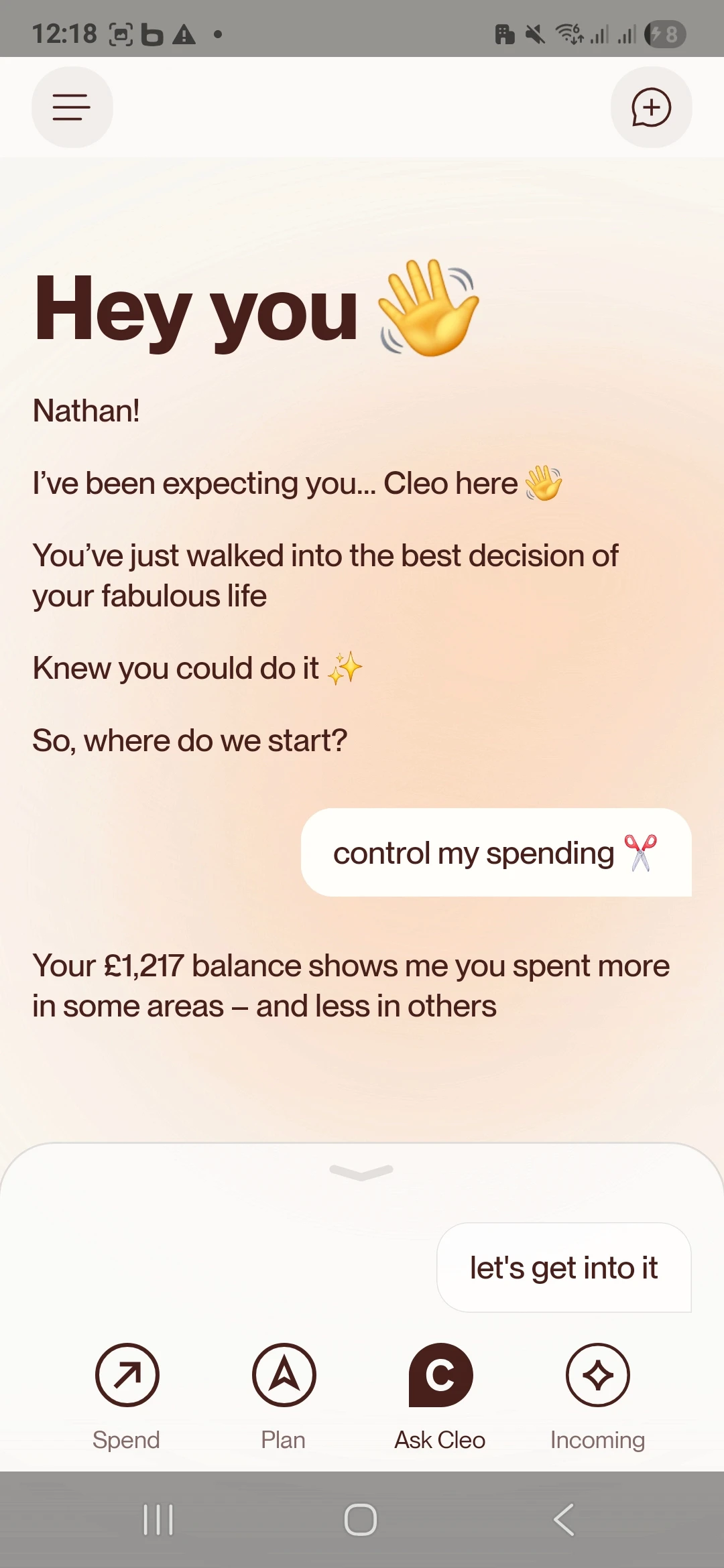
Benchmarking focused on tone, trust, and decision framing — not visual imitation.
Strategic Design Decisions
Forecast before coaching
Moolo surfaces financial direction first, not chat.
Users instantly see where they stand and where they’re heading.
Coaching as interpretation
AI translates numbers into decisions, not conversation.
Prompts are anchored in real life moments:
• Can I afford to eat out tonight?
• How am I doing this week?
• Where’s my money going?
Trust over gimmicks
No gamification, red warnings, or panic notifications.
Tone is calm, readable, and transparent.
The system is designed to reduce anxiety — not increase engagement for its own sake.
User Journey Deep Dive
Mapping emotional states, mental models, and behavioral patterns across three critical user scenarios
User Journey Deep Dive
Mapping emotional states, mental models, and behavioral
patterns across three critical user scenarios


Experience Architecture
The core Moolo UX follows a nested loop:
Snapshot – where am I now?
Forecast – where am I heading?
Coaching interpretation – why and how do I change it?
Action simulation – what if I tweak variables?
Reinforcement – nudges that guide, not nag
This loop was intentionally designed to:
reduce anxiety
build comprehension
support agency
Each layer is a stage of understanding, not just a screen.

Screens and interaction highlights
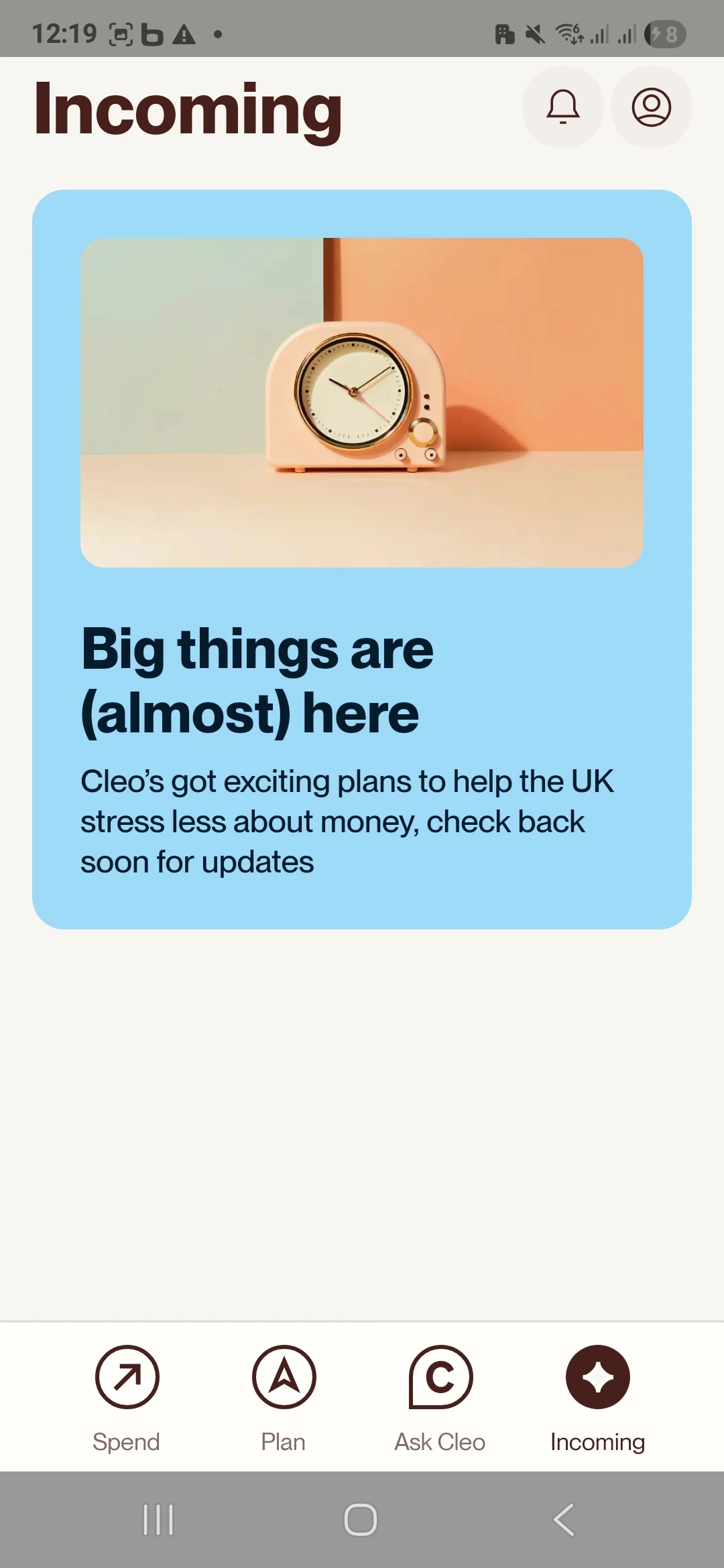
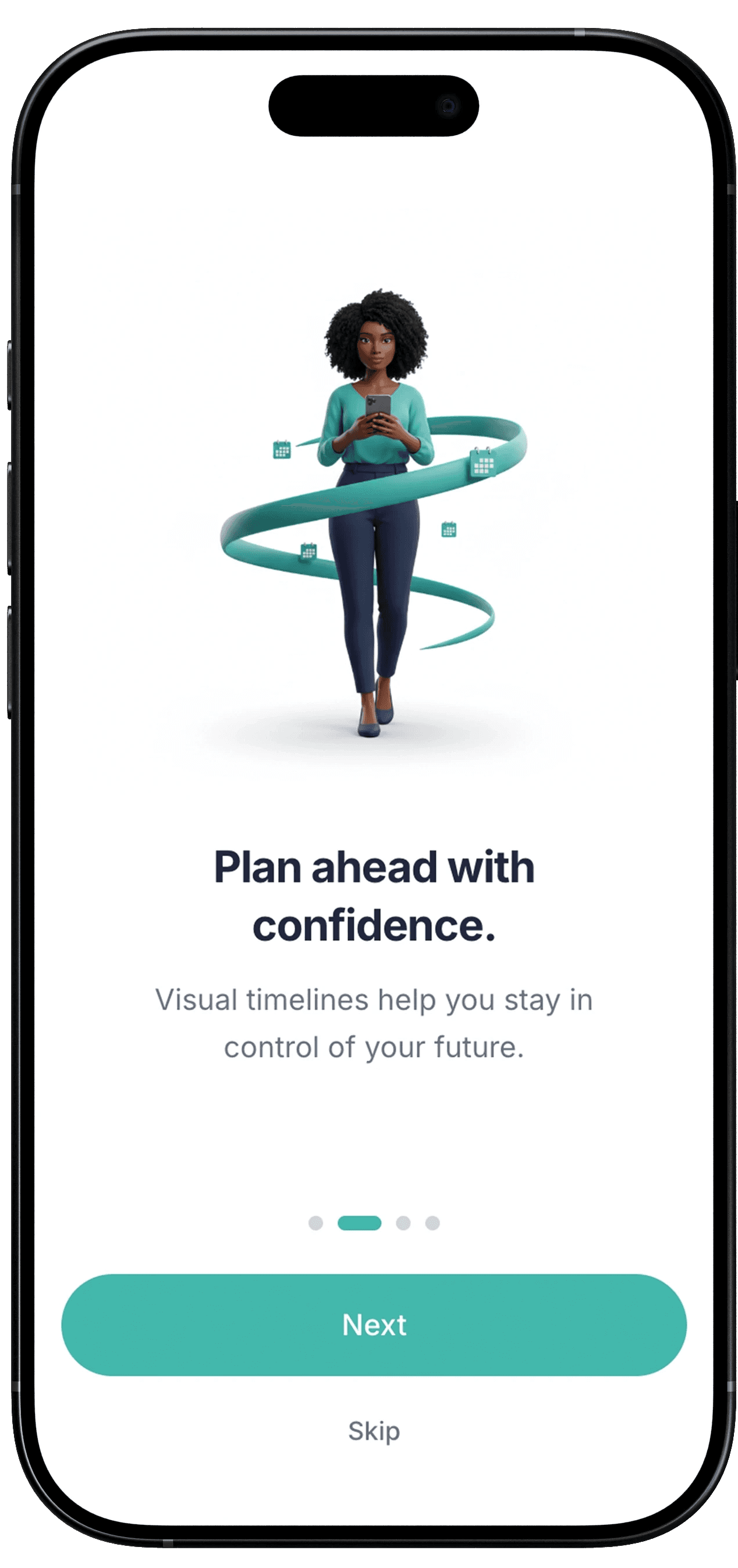
Onboarding
Introduces the product promise before any data:
Understanding money
Growth and goals
Safety in numbers
AI Copilot guidance
Illustrations use a consistent visual language to feel reassuring and professional — not gimmicky.
Onboarding builds emotional safety before data shows up.


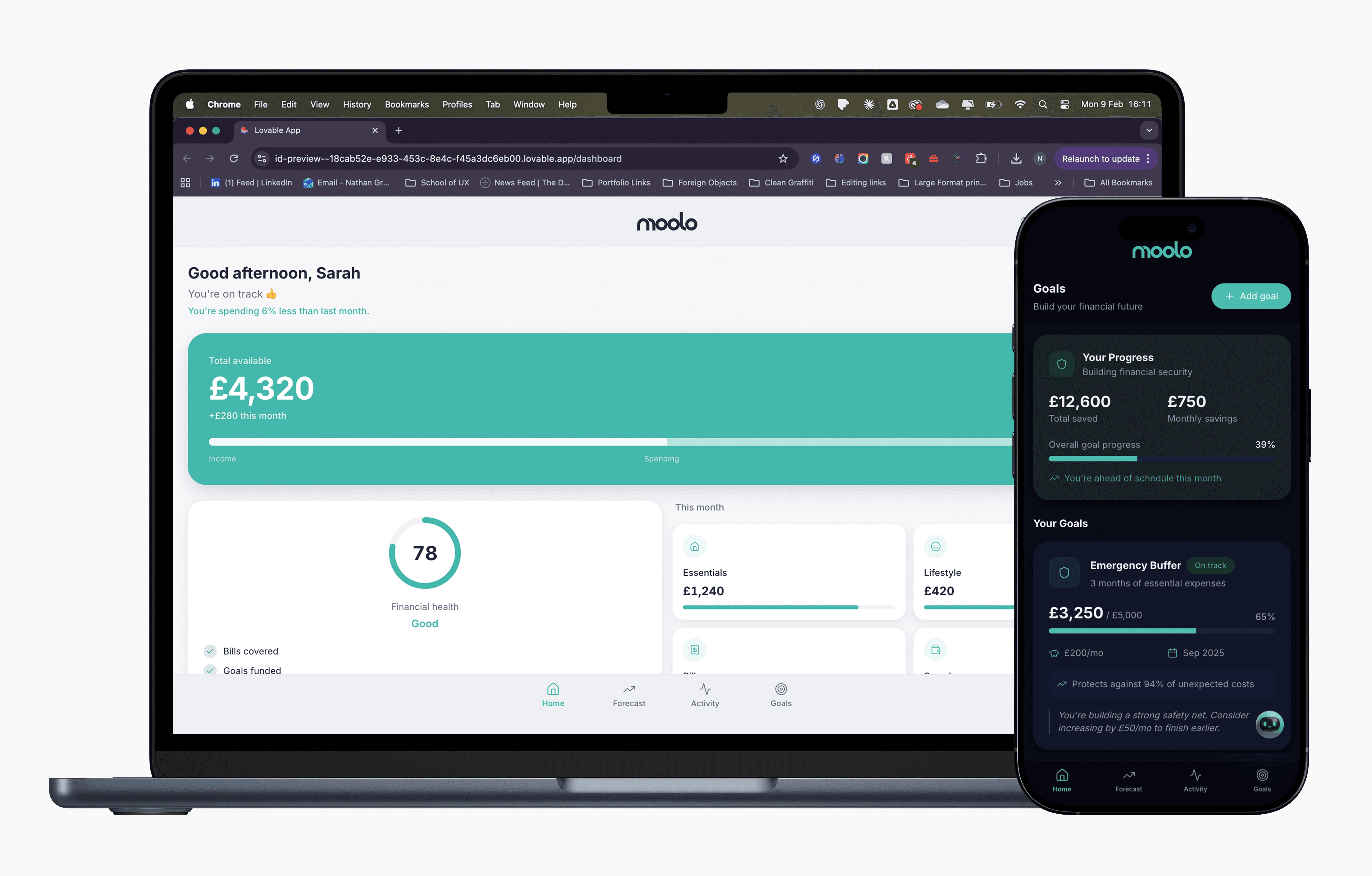
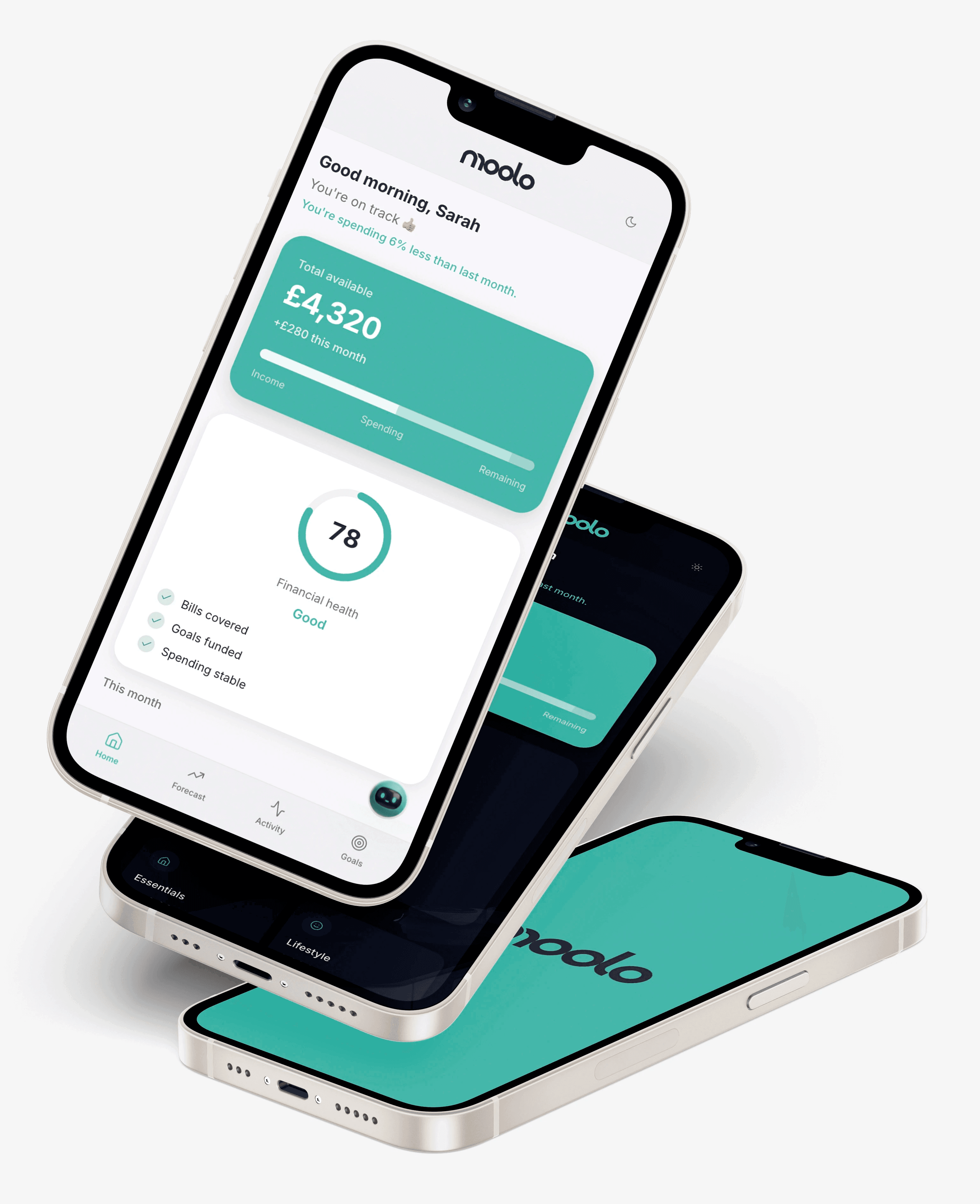
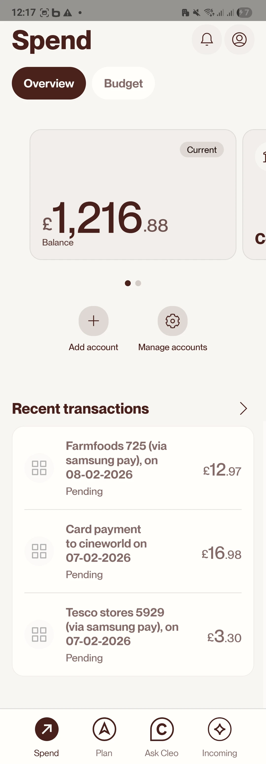
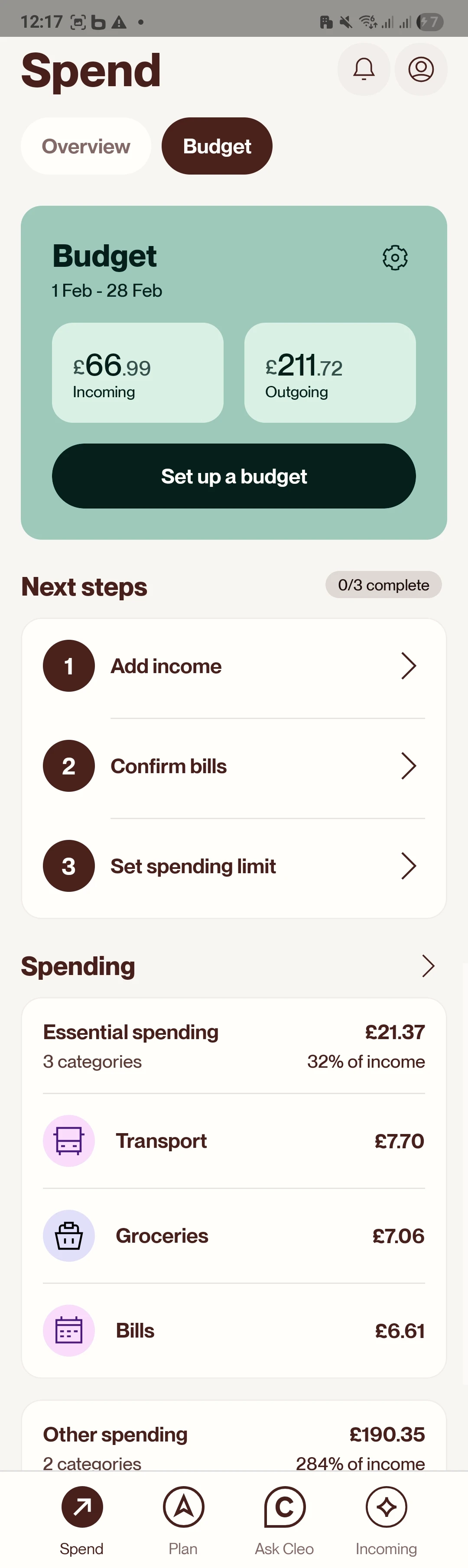
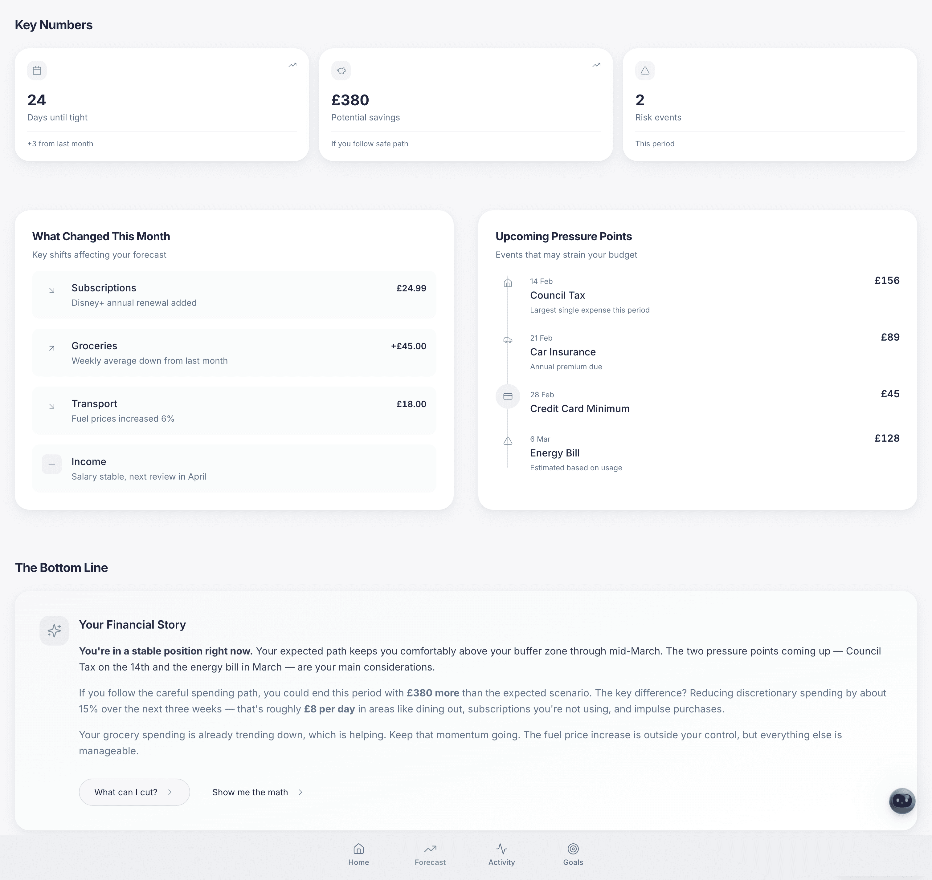
Forecast dashboard
Unlike traditional dashboards:
No line charts that feel like trading tools
Big “Total available” card
Narrative subtext
“Financial health” indicator
This answers “Am I okay?” fast.
Hero snapshot prioritises clarity over precision.


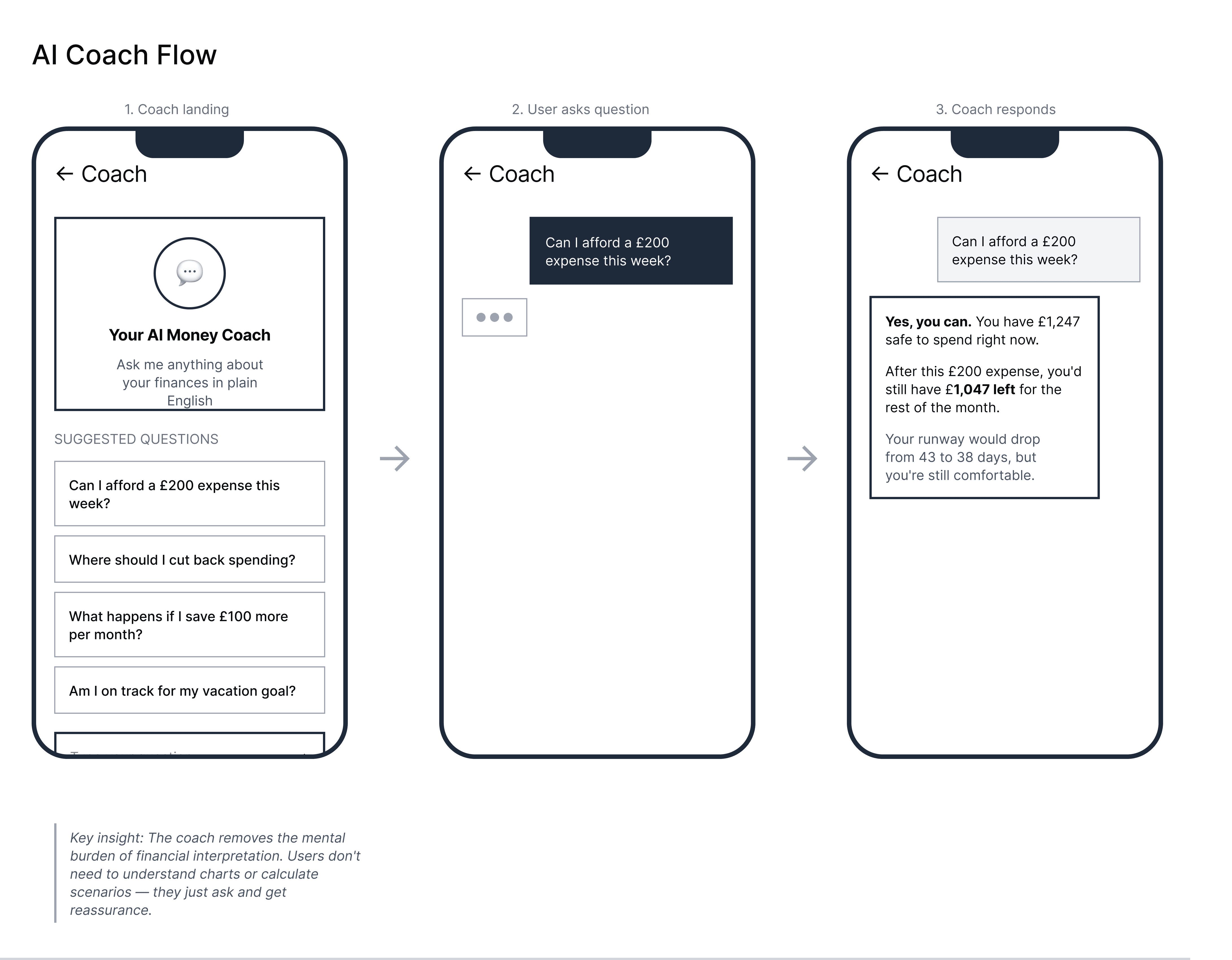
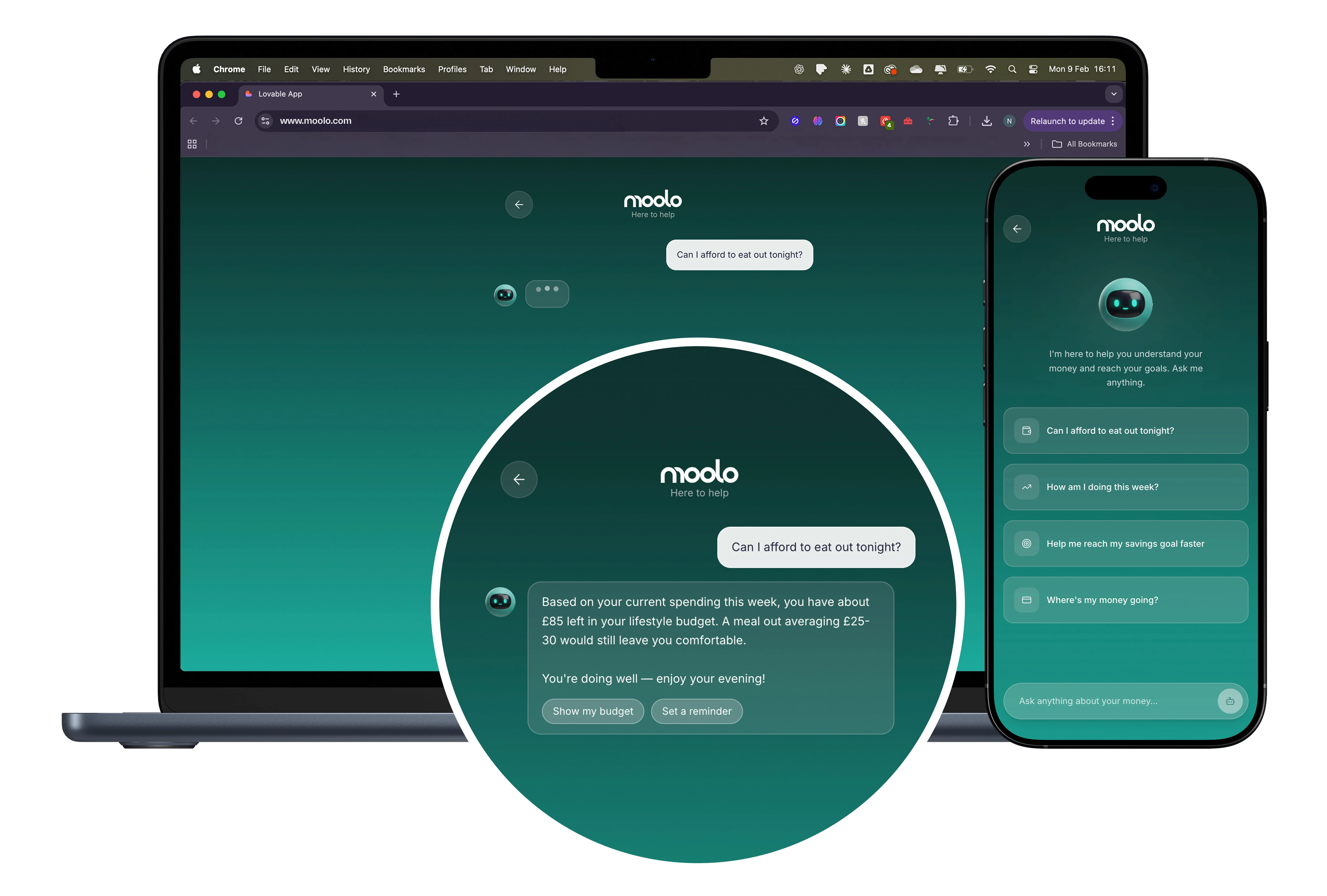
Smart Coaching
Moolo treats coaching as an interpretation layer, not a chatbot feature.
The goal isn’t conversation.
The goal is decision clarity.
Coaching sits between forecast and action — translating financial patterns into human guidance at the moment it matters.
Instead of generic alerts or gamified nudges, the system surfaces contextual prompts anchored to real decisions:
• Can I afford to eat out tonight?
• How am I doing this week?
• Help me reach my savings goal faster
• Where’s my money going?
These aren’t engagement hooks.
They’re cognitive shortcuts.
The assistant exists to reduce friction between data and behaviour — helping users move from awareness to action without overwhelm.
AI is infrastructure here, not the headline.
The experience is framed as coaching, because trust comes from clarity, not novelty.
Coaching delivers interpretation — content users want, not interruptions they ignore.
Challenges
& how I fixed them
Fragmented mindsets
Finance UX is often tools-first, not people-first.
Solution:
Reframe goals as directional confidence instead of budget lines.
Prediction vs Anxiety
Forecasting can make users anxious if visuals are intimidating.
Solution:
Friendly cards, simple progression, narrative text — not raw charts.
Design consistency
Component drift occurred as screens proliferated.
Solution:
A strict token system:
consistent spacing
iconography rules
grammar for motion
responsive layout logic
Outcome
Moolo re-imagines what personal finance feels like by:
✔ making foresight comprehensible
✔ reducing cognitive load early
✔ prioritising emotional safety
✔ positioning AI as assistance, not distraction
✔ building actionable guidance into the UI
This isn’t another dashboard — it’s a coaching product with structure, not just interface.
What i'd validate next
If moving toward a real product:
Ways to measure success
comprehension speed tests
coaching action adoption rates
forecast usefulness in decision moments
emotional comfort metrics
What I would refine
calibration of suggested prompts
personalised triggers
adaptive tutorial flow
long-term habit progression
This shows the prototype is not the final product — it’s a testable, learnable system.
More Projects

(03)
UX/UI
Lucky Dip

(01)
UX/UI
ACCA Shuffle

(03)
Branding
Baha Buns
(01)
UX/UI
Lucky Dip
(02)
UX/UI
ACCA Shuffle
(01)
(UX/UI Moolo Personal Finance Assistant)
© 2026
Project overview
Role: Lead Product Designer — UX strategy, product framing, interaction design, research, prototyping. Brand Designer
( Logo + Illustrations)
Timeline: 4 weeks
Platform: Web and Mobile app
Tools: Figma, Lovable, Firefly (illustrations), Illustrator (Logo Creation)
Project type: Fintech personal finance tool
Background & brief
Moolo is a concept designed around a core insight:
People don’t avoid finance because they lack data — they avoid it because they don’t understand the meaning of that data.
Most personal finance tools focus on reporting.
Moolo focuses on interpretation — answering:
“Am I okay?”
“What happens next?”
“What should I do?”
A benign dashboard does not solve financial anxiety.
A forecast-first guided experience does.
Problem
Problem
Traditional finance tools overwhelm users with:
dense charts
financial jargon
spreadsheets disguised as dashboards
These patterns make people feel:
unsure
confused
judged
intimidated
The core challenge became:
How do we design a product that explains the future, not just what happened?
Dense dashboards prioritise data density over decision clarity.
Research &
Benchmarking
I evaluated how existing products handle financial explanations, focusing on:
Goals of benchmarking
How do products communicate financial health?
Where do users feel confident vs overwhelmed?
What interaction models support ongoing behaviour change?
Key competitor reference: Cleo
Cleo is currently the most comparable mainstream finance app:
AI assistant with conversational insights
Everyday language over financial jargon
Habit-building nudges
However, Cleo is chat-first:
Conversation is the destination.
Moolo’s divergence: Forecast is the destination.
Moolo positions AI as support for decision-making, not the core product itself.
Benchmarking focused on tone, trust, and decision framing — not visual imitation.
Strategic Design
Decisions
Forecast before coaching
Moolo surfaces financial direction first, not chat.
Users instantly see where they stand and where they’re heading.
Coaching as interpretation
AI translates numbers into decisions, not conversation.
Prompts are anchored in real life moments:
• Can I afford to eat out tonight?
• How am I doing this week?
• Where’s my money going?
Trust over gimmicks
No gamification, red warnings, or panic notifications.
Tone is calm, readable, and transparent.
The system is designed to reduce anxiety — not increase engagement for its own sake.
User Journey Deep Dive
Mapping emotional states, mental models, and behavioural patterns across three critical user scenarios
Experience
Architecture
The core Moolo UX follows a nested loop:
Snapshot – where am I now?
Forecast – where am I heading?
Coaching interpretation – why and how do I change it?
Action simulation – what if I tweak variables?
Reinforcement – nudges that guide, not nag
This loop was intentionally designed to:
reduce anxiety
build comprehension
support agency
Each layer is a stage of understanding, not just a screen.
Screens and
interaction highlights
Onboarding
Introduces the product promise before any data:
Understanding money
Growth and goals
Safety in numbers
AI Copilot guidance
Illustrations use a consistent visual language to feel reassuring and professional — not gimmicky.
Onboarding builds emotional safety before data shows up.
Forecast dashboard
Unlike traditional dashboards:
No line charts that feel like trading tools
Big “Total available” card
Narrative subtext
“Financial health” indicator
This answers “Am I okay?” fast.
Hero snapshot prioritises clarity over precision.
Smart Coaching
Moolo treats coaching as an interpretation layer, not a chatbot feature.
The goal isn’t conversation.
The goal is decision clarity.
Coaching sits between forecast and action — translating financial patterns into human guidance at the moment it matters.
Instead of generic alerts or gamified nudges, the system surfaces contextual prompts anchored to real decisions:
• Can I afford to eat out tonight?
• How am I doing this week?
• Help me reach my savings goal faster
• Where’s my money going?
These aren’t engagement hooks.
They’re cognitive shortcuts.
The assistant exists to reduce friction between data and behaviour — helping users move from awareness to action without overwhelm.
AI is infrastructure here, not the headline.
The experience is framed as coaching, because trust comes from clarity, not novelty.
Coaching delivers interpretation — content users want, not interruptions they ignore.
More Projects
Challenges
& how I fixed them
Fragmented mindsets
Finance UX is often tools-first, not people-first.
Solution:
Reframe goals as directional confidence instead of budget lines.
Prediction vs Anxiety
Forecasting can make users anxious if visuals are intimidating.
Solution:
Friendly cards, simple progression, narrative text — not raw charts.
Design consistency
Component drift occurred as screens proliferated.
Solution:
A strict token system:
consistent spacing
iconography rules
grammar for motion
responsive layout logic
Outcome
Moolo re-imagines what personal finance feels like by:
✔ making foresight comprehensible
✔ reducing cognitive load early
✔ prioritising emotional safety
✔ positioning AI as assistance, not distraction
✔ building actionable guidance into the UI
This isn’t another dashboard — it’s a coaching product with structure, not just interface.
What i'd validate next
If moving toward a real product:
Ways to measure success
comprehension speed tests
coaching action adoption rates
forecast usefulness in decision moments
emotional comfort metrics
What I would refine
calibration of suggested prompts
personalised triggers
adaptive tutorial flow
long-term habit progression
This shows the prototype is not the final product — it’s a testable, learnable system.
(01)
UX/UI
Lucky Dip
(02)
UX/UI
ACCA Shuffle
(03)
Branding
Baha Buns